Publishing Design_Task 3(B)
Publishing Design_Task 3(b)
Week 11 - Week 14 (8/12/2024 - 12/22/2024)
Xing Yu 0361463
Bachelor of Design (Hons) in Creative Media
GCD 61404 / Publishing Design
Task 03(B)

LECTURES
Lectures 01 - 05 can be found here
INSTRUCTIONS
Task 3B - eBook - Brand Guidelines
Brand Guidelines Description: In this final
task will be required to adapt the printed book
you have designed for the purpose of on-screen reading
or the like. The design of the digital publication
will be dependent on the device it will be read from
or the type of format used; ePub/PDF/HTML. Presently
most digital books are in the ePub/eBook format (How
To Create a Fixed Layout Ebook with Adobe InDesign CC)
or a PDF interactive. We shall strive to explore and
decide on an appropriate format subject to the task
type or hardware used. One very important area to
focus on is navigation between pages; this has to be
well thought through, as the user interface must not
be an obstacle to seamless reading.
Content:
Brand profile
Visual guidelines
Applications
1) Brand profile
Brand story
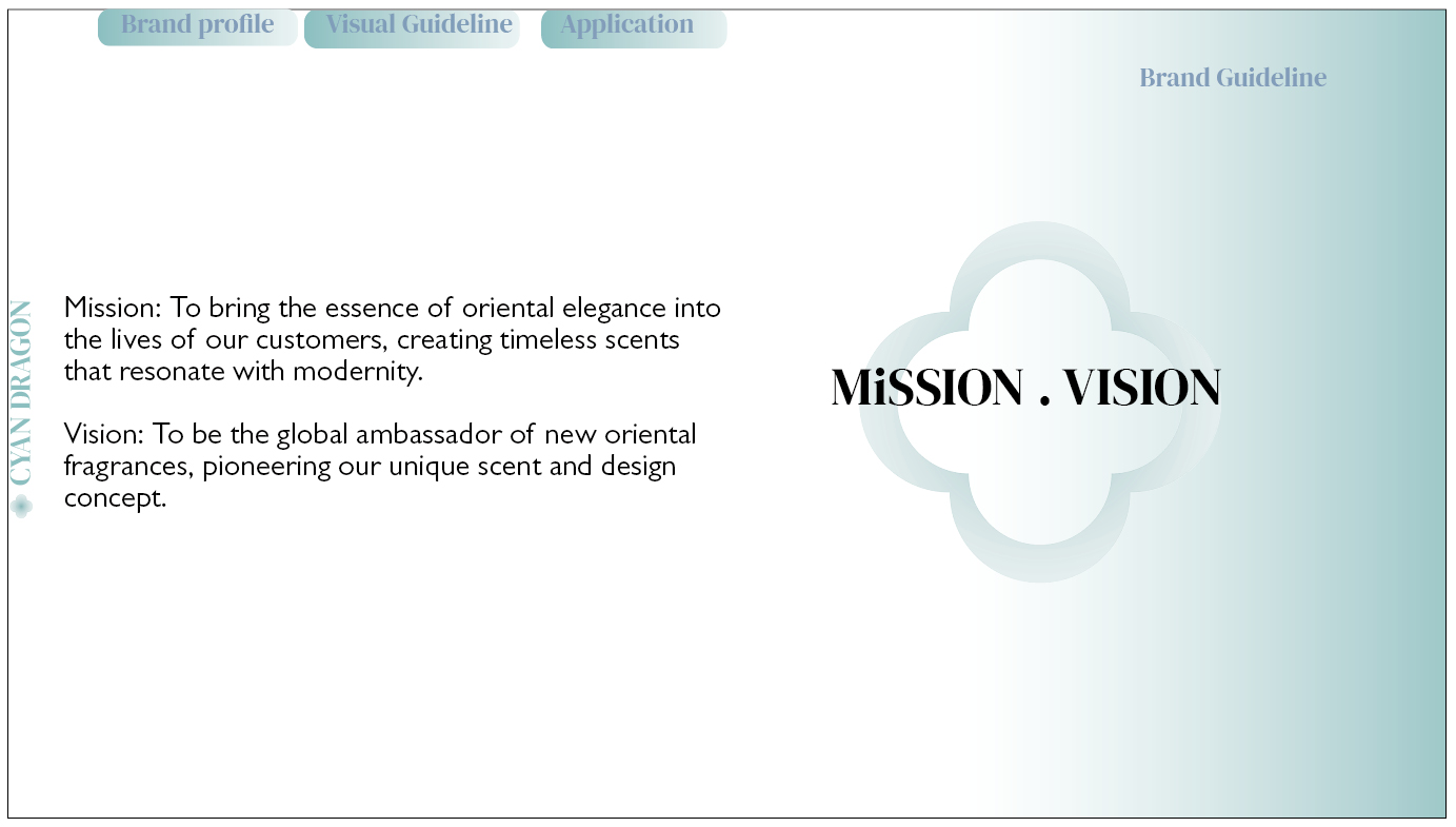
Vision and mission
Target audience
Brand values
Unique selling point
Brand positioning statement
2) Visual guidelines
Black and white logo
Reverse logo
Color logo
Logo space rationalization
Logo blank area
Logo with slogan
Logo with reason
Minimum logo size
Primary & secondary colors
Brand font
Logo-derived pattern
3) Applications
Applications
Collection
Digital presence
Environmental graphics
Layout Inspiration
First I looked online for some layouts and inspiration.


Brand Guideline Pinterest references
Layout
For this task, we need to use a size of 1366 x 768px to make
the layout look more organized. And following sir's advice, I modified the font and font size. I
used a smaller font, left a space between the text and the
pattern, and changed the font color.


 Final Thumbnails, JPEG


Final Layout Jpeg
Interactive button and animation
First I create bookmarks for the sections of text I
need to jump to.


Bookmarks
Then I created interactive buttons and bound the
corresponding bookmarks and object states that need to
be jumped. When the mouse hovers, it goes to the
state, and when the mouse is clicked, it goes to the
target.


I also converted these icons and texts into buttons so that they can return to the previous level or navigate to any page at any time.


Interaction Button
Finally I added interactive animations and page
transitions and Publish Online.

PUBLISH ONLINE :https://indd.adobe.com/view/b14d6f93-522b-4c10-b9d5-66b7b90da917
*Better and more complete interactive
PDF(Interactive)


FEEDBACKThe text and image are too close to the edge. Give them some space.It seems the body font color is too soft. may want to increase the contrast.Usually for screen design we will use sans serif font, rather than serif font.Font for titles and subtitles are too big for screen viewing. May want to make it a bit more subtle. With smaller font make the layout less busy.
Experience
This is my first attempt to create an interactive e-book, transforming a static document into an e-book full of dynamic effects and interactions. This new attempt makes me very curious.
Observation
Through the practice of this project, I not only mastered many cutting-edge interactive new technologies, but also improved my ability to analyze and solve technical problems. Every moment of overcoming technical difficulties and every successful breakthrough in navigation function made me feel accomplished, and also inspired me to learn and explore more deeply. This process of constantly challenging myself has strengthened my confidence and enthusiasm to continue to delve deeper into the field of interactive design.
Finding
In this brand guide interactive project, I deeply realized the great role and advantages of interactive elements in typesetting and publishing. Interactive elements make static guidelines vivid and better display brand content. In addition, this project also made me realize that design is not only a technical completion, but also a deep combination of creativity and logic.
FURTHER READING


评论
发表评论